Securing a safer future for everyone
Eastnets is a global leader in financial compliance and payment protection. Every day, their technology protects more than 750 institutions around the world, keeping them safe from financial crime and fraud. They came to us looking for a brand identity that could match up to their scale and ambition.
The essence of security
We started by speaking to everyone involved with Eastnets — including leadership, employees, customers, partners and analysts. Our goal was to get to the heart of the brand and uncover a unique purpose that could only be true of them. This single, unifying idea would go on to become a constant reference throughout the process, driving brand strategy and informing creative development.
Clarity and focus
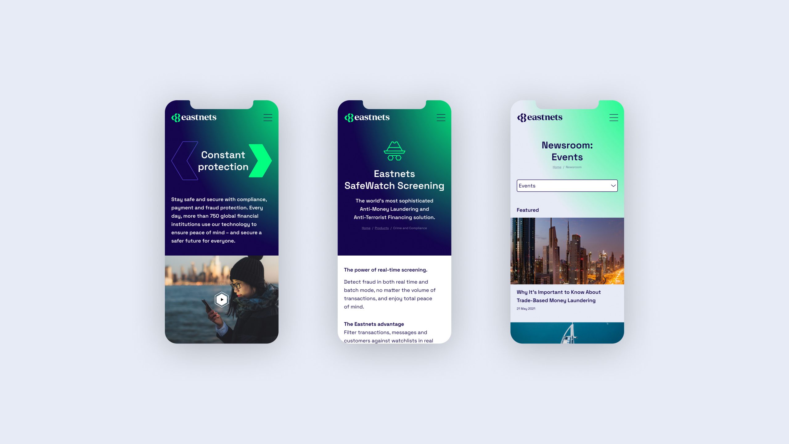
With a new strategy built on purpose, we helped the brand find clarity and focus. Now, that needed to be carried through to Eastnets’ offering. We reorganised the portfolio into gateways, connecting each product directly to customer needs.
Safe and secure
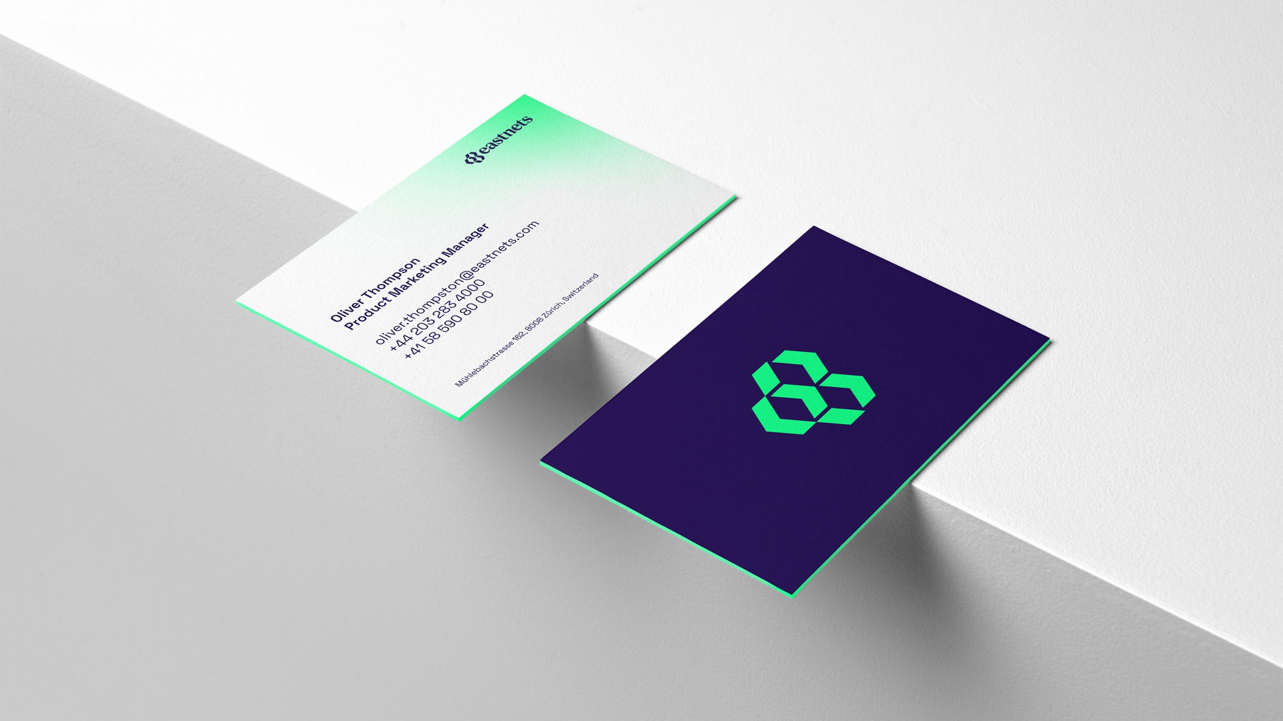
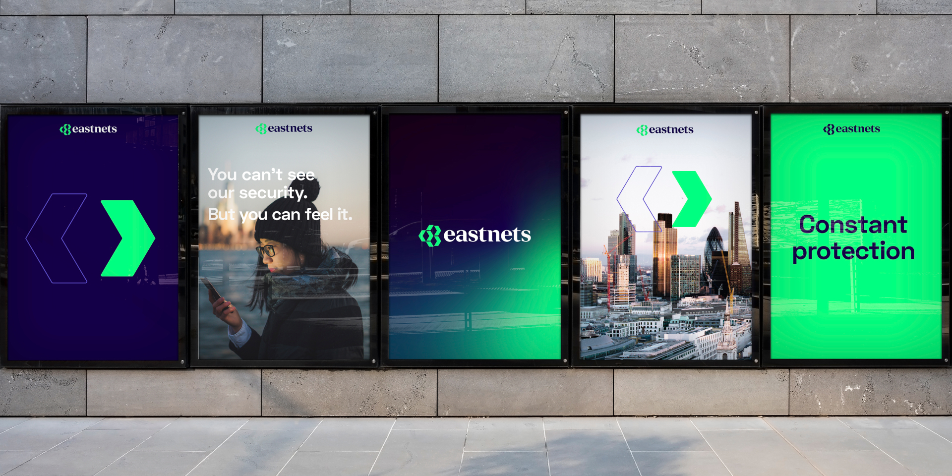
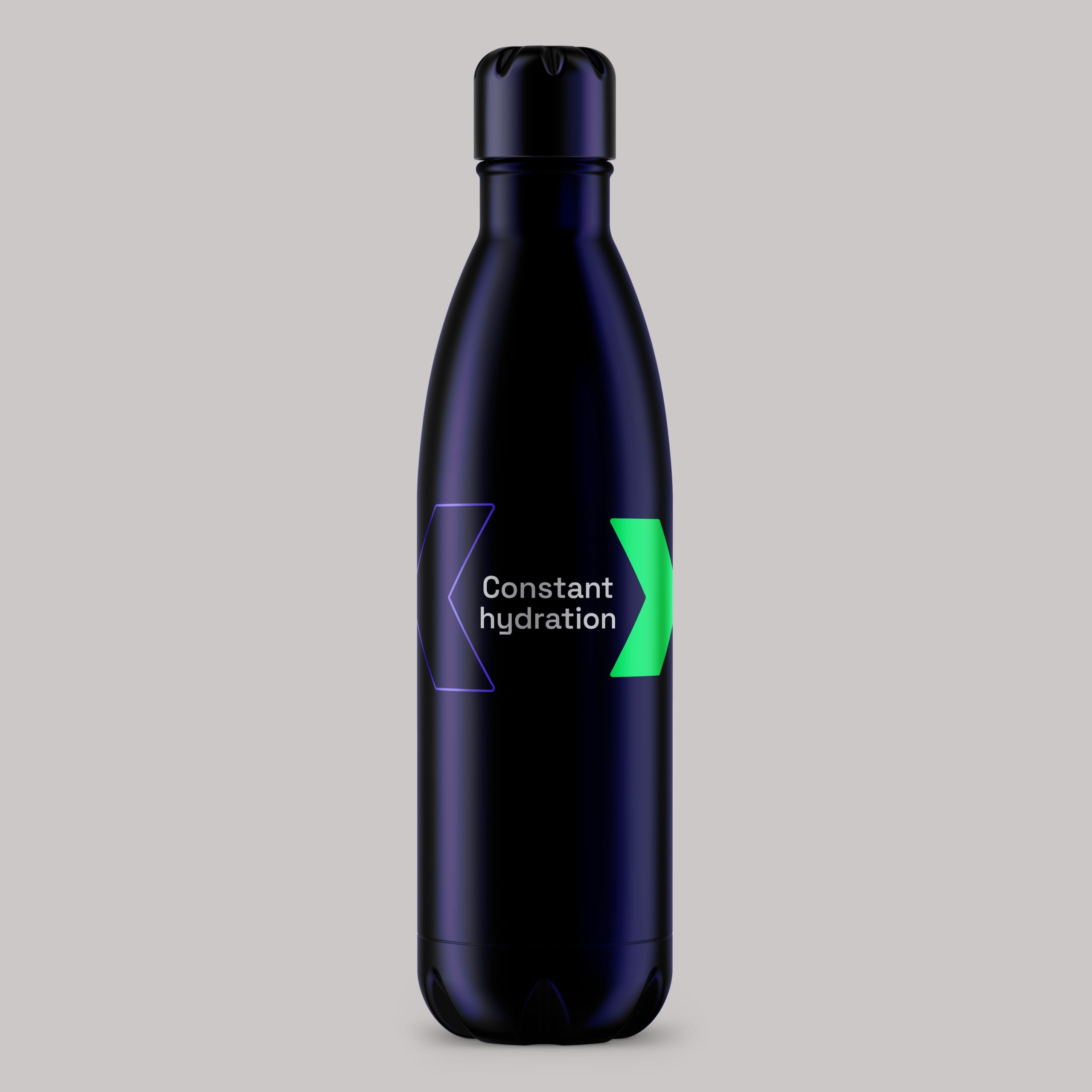
The new brand identity is designed to embody Eastnets’ purpose in every expression. We drew inspiration from the strongest and most secure shape found in nature – the hexagon – and used this throughout the design system, logo and in other touchpoints, including a new suite of icons.
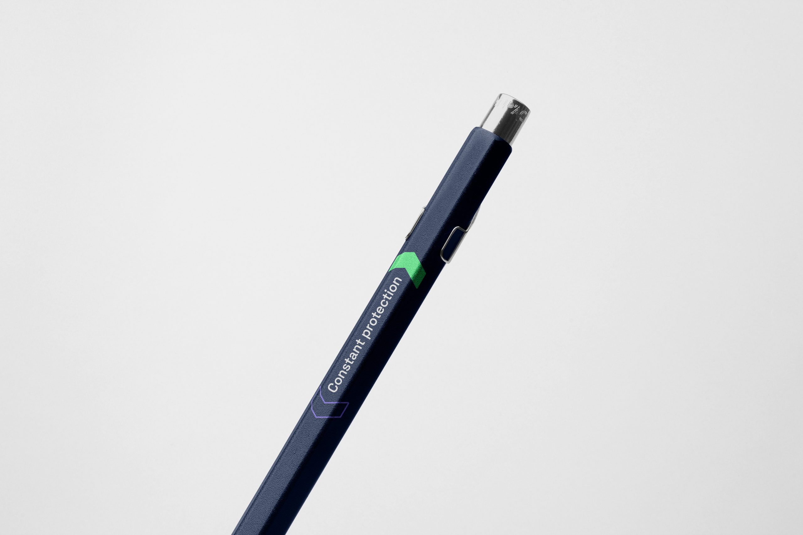
The new mark retains the east-facing arrow from the original logo but reimagines it — lighting the way to a safer future for everyone.